
← View all Printing Support Guides

Image Magic Artwork Preparation Guide

Understand How Screen Colours Become Printed Colours

RGB and CMYK create colour in different ways. Preparing artwork with the correct colour settings helps reduce unexpected shifts, but no screen can guarantee an exact match to ink, toner or printed material.

Quick Colour Guide

RGBUses red, green and blue light for screens and digital displays.
CMYKUses cyan, magenta, yellow and black process colours for printing.
Printed proofRecommended when brand colour or visual matching is important.

Follow the selected product template and any colour-profile instructions supplied by Image Magic. Different printers and materials can reproduce different colour ranges.

RGB and CMYK: What Is the Difference?

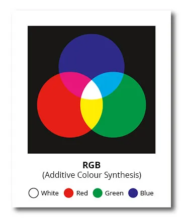
RGB colour model showing red, green and blue light

RGB: Colour Made With Light

RGB stands for Red, Green and Blue. Screens, smartphones, televisions, cameras and projectors display colour by combining light.

RGB is described as an additive colour model. Adding red, green and blue light at full strength produces white light, while the absence of light appears black.
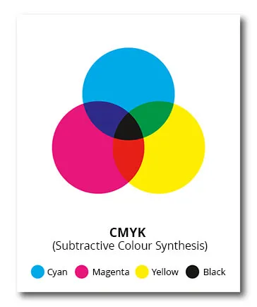
CMYK colour model showing cyan, magenta, yellow and black

CMYK: Colour Made With Ink or Toner

CMYK stands for Cyan, Magenta, Yellow and Key Black. These process colours are combined to reproduce printed images, illustrations and backgrounds.

CMYK is described as a subtractive colour model because the inks absorb parts of the light reflected by the paper or printed material.

ComparisonRGBCMYK
Colour sourceEmitted lightInk, toner or process colour on a material
Common useMonitors, websites, phones, cameras and videoCommercial printing and print-production workflows
WhiteRed, green and blue light combinedUsually the paper or material showing through
Main concernBright screen colours may fall outside the print gamutOutput depends on printer, ink, material and colour profile

What Is Colour Gamut?

A colour gamut is the range of colours that a device, colour space or printing process can reproduce. A monitor and a printer do not reproduce exactly the same range.

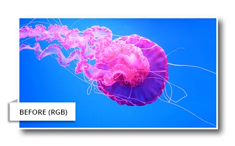
Many bright RGB colours, including vivid blues, greens, oranges and fluorescent-looking colours, may fall outside the gamut of a particular printing condition. During conversion, these colours must be changed to printable alternatives.

Bright RGB image before conversion for printingRGB screen appearance
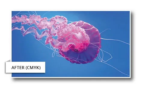
Image appearance after conversion to a printable CMYK colour spacePossible CMYK appearance
This is a simplified visual example. The actual conversion depends on the source profile, destination profile, rendering settings, printer and material.

Important: Neon, fluorescent, metallic and highly saturated screen colours normally cannot be reproduced exactly using standard CMYK process printing. A special ink, special material or an approved alternative colour may be required.

Should Artwork Be RGB or CMYK?

For many standard printed products, a print-ready PDF using CMYK process colours provides a more predictable starting point. It allows you to review the converted appearance before submitting the file.

However, RGB files are not automatically unusable. Some digital and large-format production workflows can process correctly tagged RGB images through colour-managed RIP software. Converting a photograph to an unsuitable or random CMYK profile may reduce its available colour range.

Recommended approach: Follow the product instructions. For standard documents and marketing print, prepare CMYK artwork where practical. For colour-critical photography, large-format displays or an unfamiliar output profile, contact Image Magic before converting the original file.

Keep an editable master copy of the original artwork before conversion. Avoid repeatedly changing a file from RGB to CMYK and back again.

Colour Profiles and ICC Colour Management

Colour values alone do not fully describe how a colour should appear. An ICC profile describes the colour behaviour of a device or printing condition, helping colour-management software translate colours between the source and output.

Assigning a profile

Assigning a profile tells the software how the existing colour values should be interpreted. Assigning the wrong profile can change the appearance without changing the numerical colour values.

Converting to a profile

Converting changes the colour values so that the appearance is preserved as closely as possible within the destination colour space.

Embedded profiles

Where supported, retain the correct profile or output intent when exporting the print-ready PDF so the file is not treated as untagged colour.

No universal CMYK profile

The suitable profile depends on the printing method, machine, ink, toner, paper and material. Do not select a profile only because its name contains “CMYK”.

How to Prepare Colour Artwork

Check the product instructions Confirm the required file format, colour mode, material and any product-specific template.
Keep the original editable file Save an untouched RGB or source master before preparing a production copy.
Use the correct colour profile Use a profile supplied for the intended process or ask our team when the required output condition is unclear.
Review out-of-gamut colours Pay attention to vivid blues, greens, oranges, neon effects and very saturated gradients.
Export a print-ready PDF Embed fonts and preserve the correct colour information or output intent where your software supports it.
Inspect the exported PDF Check photographs, transparencies, gradients, black text, spot colours and unexpected colour changes.

Black Text and Rich Black

Small black text and fine lines

Use 100% K black for most small black text and fine black lines unless the product template states otherwise. Using all four CMYK colours can create coloured edges if registration varies.

Large black backgrounds

Large solid black areas may use a rich-black mixture for greater visual depth. The correct mixture and total ink limit depend on the printing process and material, so ask our team before setting it.

Do not automatically use maximum values in all four CMYK channels. Excessive total ink or toner can cause production and drying problems, especially on certain papers and materials.

Brand Colours, Pantone and Spot Colours

CMYK process values are useful for standard printing, but they do not guarantee that a brand colour will match identically on every printer, paper or material.

  • Provide the official Pantone or spot-colour reference when available.
  • Provide the approved CMYK values and brand guide.
  • Tell us when colour matching is critical before production begins.
  • Supply a physical sample if matching a previous printed item.
  • Request a printed proof when an acceptable colour range must be approved.

Spot colours may be printed using a dedicated premixed ink in processes that support it. Digital printers often simulate a spot colour using their available process inks or toner, so an exact Pantone match is not automatically guaranteed.

Why Printed Colour Can Still Vary

Monitor settings

Brightness, contrast, display type, viewing angle and calibration affect how artwork appears on screen.

Paper and material

Coated, uncoated, coloured, transparent, textured and synthetic materials reflect and absorb colour differently.

Printing technology

Digital toner, inkjet, latex, UV and offset processes can reproduce the same file differently.

Finishing

Matt lamination, gloss lamination, varnish and other finishes can change perceived saturation, contrast and depth.

Digital Proof, Soft Proof or Printed Proof?

Proof typeUseful forColour limitation
PDF or digital proofChecking wording, layout, page order, size and obvious artwork issuesDoes not provide an exact physical colour reference
Soft proof on screenPreviewing the effect of an output profile on a calibrated displayDepends on the monitor, calibration, profile and viewing environment
Printed proofApproving a physical colour direction before the main production runMay still differ if the final material or production process changes

A printed proof may involve additional charges and production time. Confirm availability before placing a colour-critical order.

Common Colour Artwork Mistakes

Trusting the screen as an exact colour sample Screens emit light and may be brighter or more saturated than print.
Using neon RGB colours without checking conversion Bright screen colours may become duller or shift after conversion.
Assigning a random CMYK profile The wrong profile may create larger colour changes than a managed conversion.
Mixing RGB, CMYK and spot colours without review Different objects may convert differently during production.
Using four-colour black for small text Minor registration movement may create coloured fringes around the text.
Not identifying a colour-critical job Our team cannot plan proofing or matching requirements unless they are communicated.

Colour Checklist Before Uploading

✓Follow the product-specific colour instructions.
✓Keep an editable copy of the original artwork.
✓Review RGB-to-CMYK changes before submission.
✓Check photographs, gradients and transparent effects.
✓Use 100% K for most small black text and fine lines.
✓Provide Pantone references or brand guidelines when relevant.
✓Inspect the exported print-ready PDF.
✓Request a printed proof for colour-critical work.

Frequently Asked Questions

Must every printing file be converted to CMYK?

Not necessarily. Many standard print products benefit from CMYK preparation, while some colour-managed digital and large-format workflows can process tagged RGB images. Follow the product instructions or ask our team before converting colour-critical files.

Why does my printed colour look different from my monitor?

Monitors produce colour with light, while printing uses ink or toner on a physical material. Their colour gamuts, brightness and viewing conditions are different.

Can Image Magic guarantee an exact Pantone colour?

Exact matching depends on the selected print process, ink, material and whether a dedicated spot-colour process is available. Discuss the requirement and approve a printed proof before production.

Is a PDF proof accurate for colour approval?

A PDF proof is primarily for checking content and layout. It cannot guarantee exact printed colour because every screen displays colour differently.

Will lamination change the colour?

It can change the perceived contrast, saturation and surface appearance. Gloss lamination may appear richer, while matt lamination may appear softer or less reflective.

Is Colour Accuracy Important for Your Printing Project?

Send us the product, material, artwork file and any Pantone, CMYK or physical colour reference. Tell us before production when colour matching is critical so we can advise on proofing and suitable printing options.